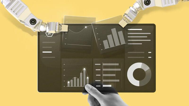
How AI-powered dataviz drives results
Two examples of how companies are putting digital dashboards and dataviz to work


Editor’s note: This story is part of a package exploring how companies are using AI and digital dashboards to make smarter, faster decisions. Read the companion story: How AI helps companies visualize progress.
How are companies putting digital dashboards to work? Here are two prime use cases of the technology:
1. Intelligent forecasting
Allstacks, a software startup, makes a data visualization tool to help software development teams stay on schedule and in communication with the rest of the business.
COO Adam Dahlgren says his favorite example of dataviz in action involves a publicly traded customer that attempted to forecast its own production schedule and was confident that a new software product would hit the market within the next three months, precisely on schedule.
But the company based its forecast on incomplete data. “When we connected all the data systems, we were able to produce a portfolio report and a forecast data visualization that let them click deeper into different data streams,” says Dahlgren.
That not only showed the company that its product was likely to run 2.5 months late, it did so visually—through an intuitive interface that everyone in the company, not just the product development team, could wrap their heads around.
“By being able to deconstruct the forecast, they were able to see their internal estimates were wrong,” says Dahlgren. The updated forecast not only changed the sales outlook, but it helped provide better guidance to Wall Street analysts and thus helped avoid missing sales forecasts.
2. Scenario planning
The forecasting ability of AI-powered dataviz is also helping the hospitality industry price rooms and fill event spaces.
When Amaze Insights, which provides a dashboard tool for the industry, launched a new tool last year, Aimbridge Hospitality decided to try it. Aimbridge, the largest third-party hotel management company in the world, needs to run separate reports for every hotel in its portfolio.
“Excel was used extensively to try and understand the pace of bookings compared to previous years,” says Nick Horgan, chief commercial officer at Amaze. “With our dataviz tools, hotels are now able to see a visual representation of this data and, more importantly, they can do more with it.”
For example, they can exclude 2020 data to more easily account for pandemic anomalies. Another tool lets hoteliers get a visual representation of how they are using their historically underutilized function and meeting spaces, giving them a pathway to improving profitability by better understanding demand and gauging the value of each booking.
Such dashboarding insights can also save lives, or at least lead to improved healthcare resources. Olgam Life, which operates blood plasma donation centers in New York and Florida, has used AI to evolve its dataviz tool capabilities.
This has helped the organization “uncover hidden patterns, perform predictive modeling, and generate actionable insights,” says Aliza Naiman, its marketing manager. Olgam Life’s dashboard tracks metrics like how often donors visit its centers, their responsiveness to marketing campaigns, and their engagement patterns.
All of this information, presented in an easy-to-understand dashboard, helps Olgam Life personalize the way it communicates with donors. As a result, says Naiman, “we have increased donor retention rates, improved contribution levels, and strengthened relationships with our key supporters.”
A word of caution
When getting started with AI-powered visualizations, practitioners say it’s important to begin with understanding your data and the insights you hope to glean from it. AI isn’t a magic bullet, and it never will be. “The goal won’t be to get things perfect,” says Scott Berinato, senior editor of Harvard Business Review and author of “Good Charts,” “but to get you closer to what you need so you don’t have to spend a lot of time fine-tuning design.”
Where you start with dataviz depends on the specific data resources, intended use cases, and goals of your business. But no matter what your goals, dataviz equipped with AI is easier than ever. That’s thanks largely to software tools that are now available as well as the many books and web tutorials that show you how to start. Even a tool as basic as Google Sheets now has AI features that can suggest visualizations based on the type of data you are working with.
However, Max Shron, a data strategist and the author of “Thinking With Data,” offers a bit of caution to users who may become overly enamored with AI dataviz tools. AI features alone, he says, will not address the fundamental reasons data visualizations are needed in the first place: to help people understand complex information.
“New technology can help companies more quickly produce good visualizations,” says Shron, “but learning to interpret visualizations is more of a fundamental skill that is worth teaching to employees” through formal training and education sessions. “It’s not necessarily something they're going to get just from better technology.”
We want to hear from you! Please send us your feedback, and get informed about exciting updates from The Works. Drop us a line: theworks@freshworks.com.


