
The cost of moving fast
As AI adoption becomes commonplace in the workplace, Fortune 100 leaders are expressing concern: Are we de-skilling a generation of workers? Matt Beane is there to hear them out—and provide some fixes.
Derek Korte
8 min read

Inaugural issue: The Works Magazine
The inside stories on how McLaren, New Balance, and others turn service performance into a competitive edge
Team Freshworks
12 min read

The most AI-bullish industry is also the most overwhelmed by it
Financial services outspends every sector on AI and reports the greatest complexity burden. Here's what's driving the gap, and how some businesses are closing it.
Laura Rich
3 min read

ICYMI: AI loops, AI-ready data, and an IT job boost
Your curated briefing on the week’s smartest news and ideas for AI-powered service management
The Editors Of The Works
2 min read
Articles and insights
Filter by category

The stakes of IT are different in health care
For cancer clinics, hospitals, and pharmaceutical companies, service management is part of the care delivery chain
Laura Rich
4 min read

AI’s real business payoff: abundance
In an interview with ComputerWeekly, Freshworks CIO Ashwin Ballal explains why AI gives agile enterprises the freedom to chase more ideas than their resources once allowed
Derek Korte
1 min read

Designing AI-powered software for agile enterprises
Instead of arranging screens, designers are shaping behavior and judgment, says Kedar Shiroor, SVP of design and research at Freshworks, so the end result 'just works'
Derek Korte
4 min read

AI transformations fail when they forget about people
Tools alone don’t make for successful service management. Wendy Turner-Williams lays out a people-focused AI transformation plan for leaders.
Howard Rabinowitz
4 min read

Refresh 2026: Unified data, agentic AI, and the agile enterprise
To help agile enterprises accelerate service transformation, company leaders unveiled new innovations in agentic AI and a unified platform approach
Silvina Gils-carbo
3 min read
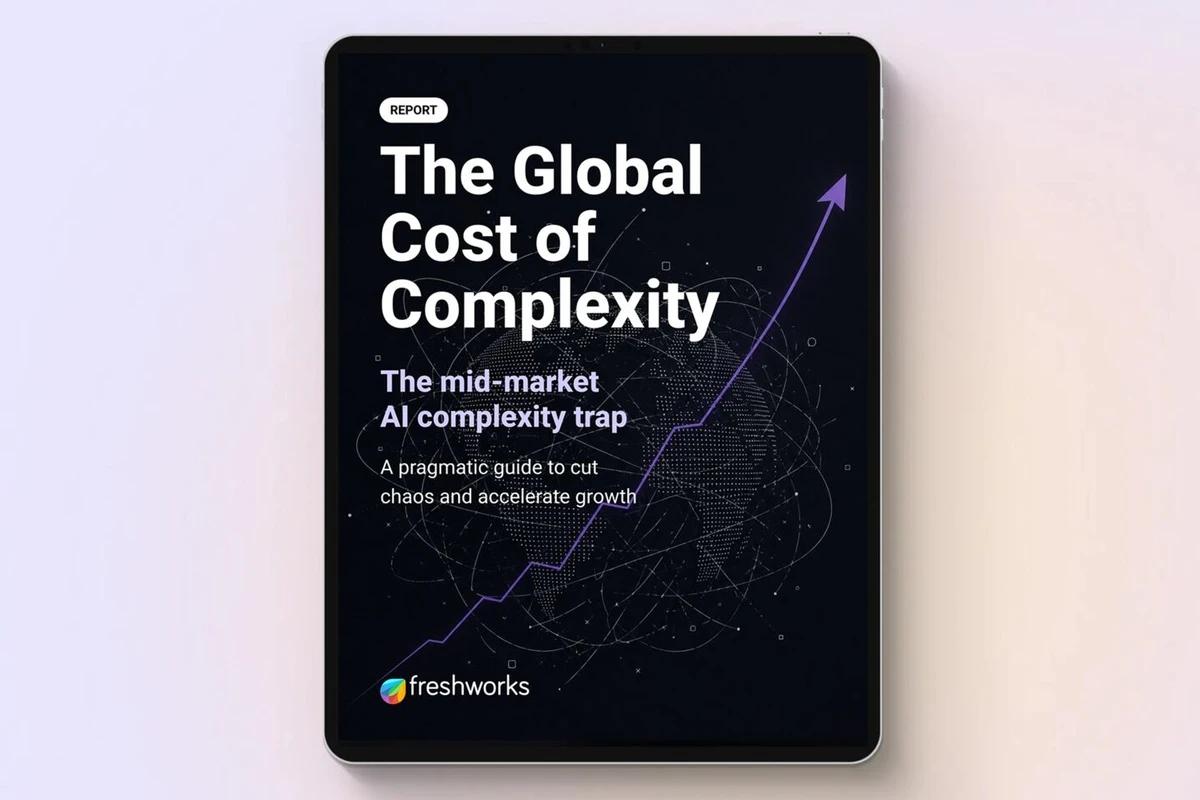
The mid-market’s $16 billion drain
Mid-market organizations are investing more in AI than ever. Complexity is consuming the returns before they arrive
Laura Rich
3 min read
Refresh 2026 recap: Shifting from tickets to prevention with AI
Freshworks introduces the AI maturity curve for IT service operations and illustrates how companies are advancing value with AI
Silvina Gils-carbo
2 min read
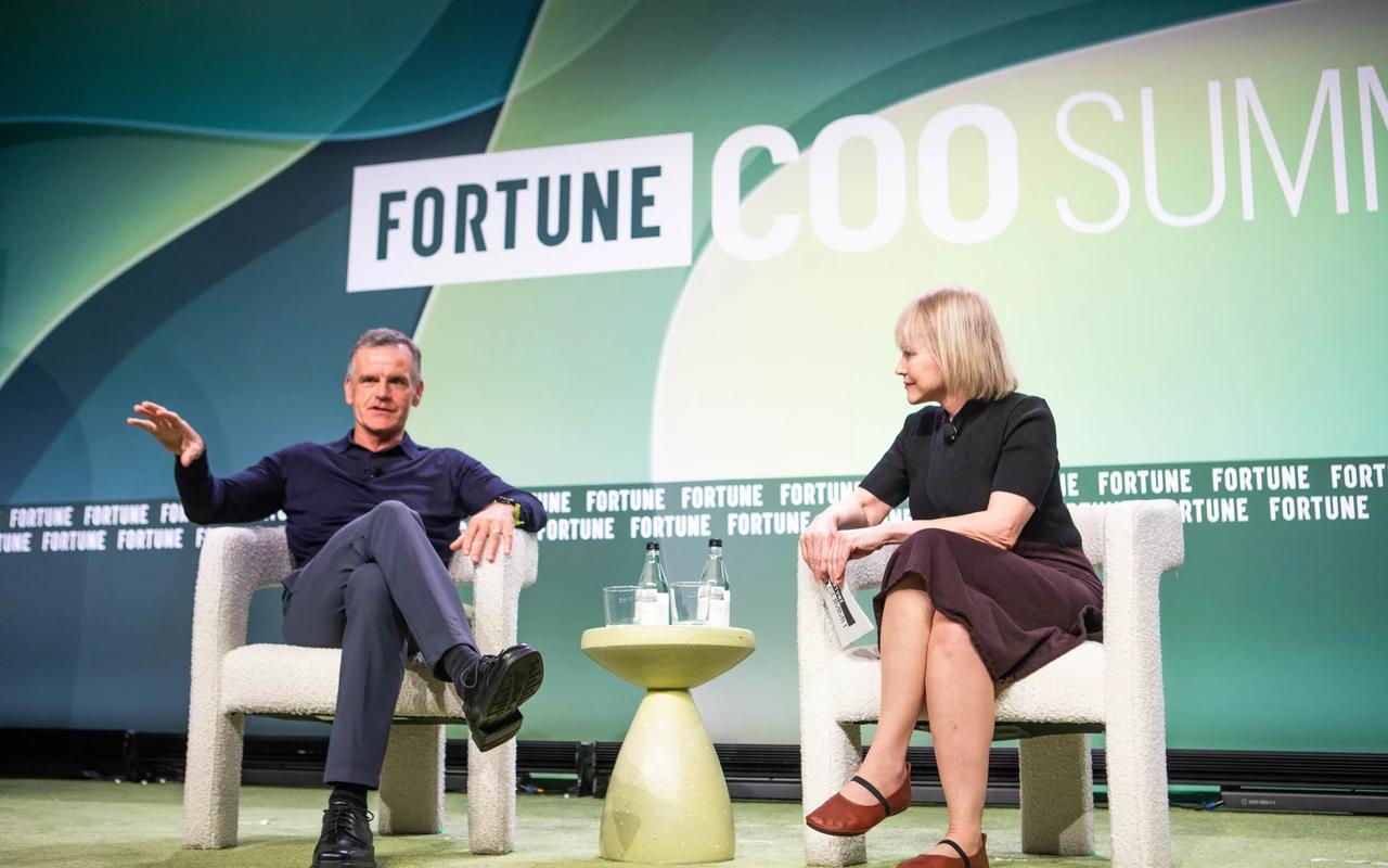
Dennis Woodside at the Fortune COO Summit
Freshworks’ CEO made the case that AI transformation starts with a business problem, not a technology decision
Laura Rich
1 min read