Transform your marketing to boost revenue growth
Generate sales-ready leads, amplify multichannel engagement, and drive business impact with AI-powered marketing automation.

Attract, nurture, & convert with ease
Accelerate your sales pipeline and improve your marketing ROI.
Maximize reach with multichannel engagement
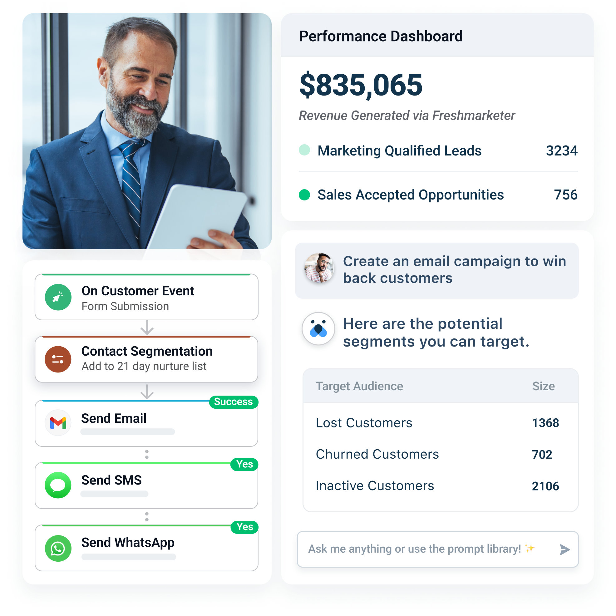
Be it email, SMS, WhatsApp, or social media — engage with customers on the channels they like. Create customized landing pages, web forms and intelligent chatbots to capture leads and accelerate sales.
Start free trial

Unlock powerful insights with first-party data
Get a unified view of customer interactions with your website, past campaigns, and sales teams. Use AI-driven lead scoring and predictive segmentation to run personalized campaigns that drive more opens, clicks, and conversions.
Get a demo

Improve efficiency with advanced automation
Craft campaigns effortlessly with your AI-assistant. Build always-on, multichannel journeys in minutes to nurture leads, recover abandoned carts, drive repeat purchases, and improve retention.
Start free trial
Capabilities
Everything you need to turn your business into a revenue magnet.
See what’s newFreddy AI for marketing
Launch personalized campaigns 10x faster with AI-powered insights and content.
Predictive & behavioral segmentation
Identify the right audience for each campaign with custom and predictive segments.
Multichannel engagement
Reach customers on their favorite channels from a single platform.
Conversational marketing
Use AI-powered chatbots to capture leads and accelerate sales.
Real-time customer journeys
Create automated cross-channel journeys to drive business outcomes.
Performance analytics & CRO
Analyze campaign and website performance to drive higher conversion rates.
Get started with frictionless migration and out-of-the-box integrations
Migrate contacts, campaigns, and historical data from your current Marketing Automation or CRM Platform with our dedicated onboarding team — Absolutely free of cost!
Integrate with any of 1000+ Apps in the Freshworks Marketplace to get started in minutes!
Explore Integrations

Why customers love Freshmarketer


With Freshworks on the scene, the team had the right features to track CTRs, plan a proper email marketing campaign, and segment their list too. Moreover, now we have quantifiable data that we’ve never seen before.
We started using Freshmarketer for our email newsletter, and we saw the open rates increase from 19% to 46% and the click rates increase from 1.6% to 5%. This led to an increase in our website traffic and eventually attributed to a 5% increase in revenue.

I needed a solution that was easy to implement and has a lot of automated flows. We use Freshmarketer as our retention tool and it’s been extremely helpful to my marketing team.

Freshworks has significantly influenced all our marketing & sales endeavors across multiple businesses. Customer support is paramount in CRM, and Freshworks consistently sets an exemplary standard for addressing all our marketing queries, whether related to the product or other requirements
Get sales and marketing on the same page
Bring everything together in one complete CRM solution with a single source of truth for each customer’s journey. Share context, customize communications, and drive revenue together.
Explore Freshsales Suite
Sign up for your free trial today
21 days. No credit card required. No strings attached.